The Poisson distribution is a discrete probability distribution that describes the number of events that occur in a fixed interval of time or space. It is often used to model rare events, such as the number of phone calls received by a call center in a given hour. The Poisson distribution is characterized by a single parameter, lambda, which represents the average number of events that occur in the interval.
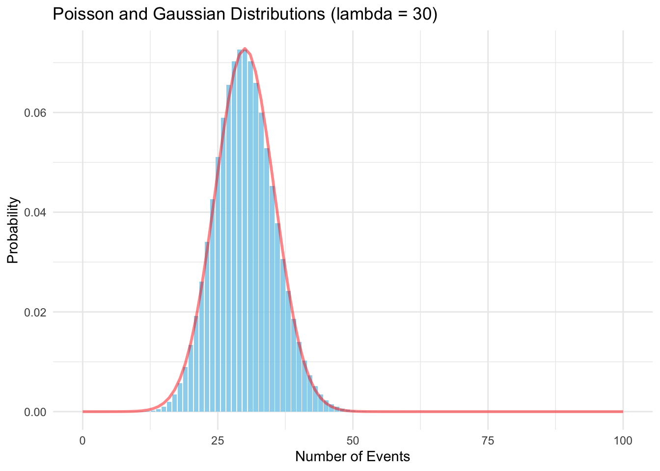
When the average number of events is large (lambda > 20), the Poisson distribution can be approximated by a Gaussian distribution with the same mean and variance. This approximation is known as the Sterling approximation, and it is often used to simplify calculations involving the Poisson distribution.
If you plot the Poisson distribution and overlay the Gaussian distribution with the same mean and variance, you can see that the two distributions are very similar when lambda is large especially around the mean.
# Load necessary librarylibrary(ggplot2)# Set the lambda parameter for the Poisson distributionlambda <-30# Generate a sequence of valuesx <-0:100# Calculate the Poisson probabilitiesy_pois <-dpois(x, lambda)# Calculate the Gaussian probabilitiesmean <-30sd <-sqrt(lambda)y_gauss <-dnorm(x, mean, sd)# Create a data frame for plottingdata <-data.frame(x, y_pois, y_gauss)# Plot the Poisson distribution and overlay the Gaussian distributionggplot(data, aes(x = x)) +geom_bar(aes(y = y_pois), stat ="identity", fill ="skyblue", alpha =0.86) +geom_line(aes(y = y_gauss), color ="red", linewidth =1, alpha =0.48) +labs(title ="Poisson and Gaussian Distributions (lambda = 30)",x ="Number of Events",y ="Probability" ) +theme_minimal()
Note that the variance of the Poisson distribution is equal to its mean, so the standard deviation is the square root of the mean. This is why the Gaussian distribution used in the Sterling approximation has the same mean and standard deviation as the Poisson distribution.
\[n! = n^n \int_0^\infty y^n e^{-ny} dy = n^n\,n \int_0^\infty e^{n(\log y -y)} dy.\]
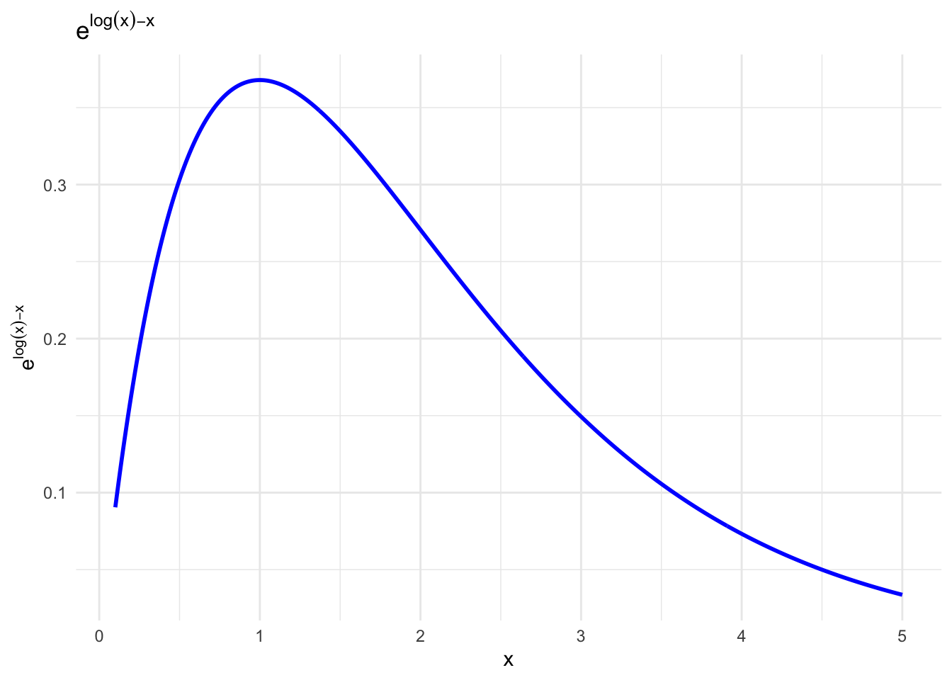
A plot of the function \(f(y) = e^{n(\log y -y)}\) shows that the integral is dominated by the region around the maximum of the function, which is at \(y = \log n\) or \(y=1\). We can then expand the function around this point to second order:
# Define the functionf <-function(x) {exp(log(x) - x)}# Generate a sequence of valuesx_vals <-seq(0.1, 5, by =0.01)# Calculate the function valuesy_vals <-f(x_vals)# Create a data frame for plottingdata_plot <-data.frame(x = x_vals, y = y_vals)# Plot the functionggplot(data_plot, aes(x = x, y = y)) +geom_line(color ="blue", linewidth =1) +labs(title =expression(e^{log(x) - x }),x ="x",y =expression(e^{log(x) - x }) ) +theme_minimal()
The function \(f(y) = \log y -y\) has a maximum at \(y = 1\) and an expansion gives:
This is almost a Gaussian integral and it’s allowed to extend the lower bound to minus infinity since the value at zero is equal to \(e^{-n/2}\) which is negligible for large \(n\). The integral is then
and the Gaussian is equal to \(\sqrt{2\pi/ n}\) which together with the extra \(n\) in front of the integral gives \(\sqrt{2\pi\,n}\). The Sterling approximation is then
\[n! \simeq n^n e^{-n}\, \sqrt{2\pi n}.\]
Higher orders can be included in the expansion of the function \(f(y)\) to get more accurate approximations.
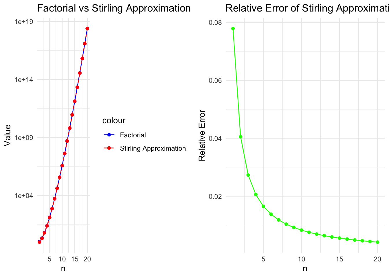
Now, how good is the approximation? Let’s plot the exact factorial and the Sterling approximation for a range of values of \(n\):
# Load necessary librarylibrary(ggplot2)# Define factorial functionfactorial_values <-function(n) {factorial(n)}# Define Stirling's approximation functionstirling_approx <-function(n) {sqrt(2* pi * n) * (n /exp(1))^n}# Generate datan_values <-1:20factorial_vals <-sapply(n_values, factorial_values)stirling_vals <-sapply(n_values, stirling_approx)relative_error <-abs(stirling_vals - factorial_vals) / factorial_vals# Create data frame for plottingdata <-data.frame(n = n_values, Factorial = factorial_vals, Stirling = stirling_vals, Error = relative_error)# Plot factorial vs Stirling's approximationp1 <-ggplot(data, aes(x = n)) +geom_line(aes(y = Factorial, color ="Factorial")) +geom_point(aes(y = Factorial, color ="Factorial")) +geom_line(aes(y = Stirling, color ="Stirling Approximation"), linetype ="dashed") +geom_point(aes(y = Stirling, color ="Stirling Approximation")) +scale_y_log10() +# Log scale for large valueslabs(title ="Factorial vs Stirling Approximation", x ="n", y ="Value") +scale_color_manual(values =c("blue", "red")) +theme_minimal()# Plot relative errorp2 <-ggplot(data, aes(x = n, y = Error)) +geom_line(color ="green") +geom_point(color ="green") +labs(title ="Relative Error of Stirling Approximation", x ="n", y ="Relative Error") +theme_minimal()# Arrange plots in a gridlibrary(gridExtra)grid.arrange(p1, p2, ncol =2)
The approximation is very good for large values of \(n\) and the relative error decreases exponentially as \(n\) increases. For small values of \(n\), the approximation is less accurate, but it becomes increasingly accurate as \(n\) grows. So, the Sterling approximation is totally fine for values related to statistical physics and ensembles of particles.